Project Overview
When I joined AG5 as the solo UX/UI designer, their existing site felt patched together, inconsistent, and failed to demonstrate the real value of their skills management platform. Over two years of remote collaboration with marketing and product teams, I led a ground-up redesign that combined an immersive homepage demo, a robust design system, and streamlined content structure. The goal was to present AG5 as a modern, trustworthy solution and guide visitors smoothly from discovery to demo request.
My Role
I owned the entire design lifecycle, from aligning on objectives with stakeholders to handing off final assets to developers. Every morning I’d sync with marketing to refine copy and with product to source real dashboard screens for animations. My daily responsibilities included:
Architecting and maintaining a scalable design system that enforced consistency and sped up future updates
Leading UX workshops to clarify user journeys and identify high-impact feature pages
Designing and prototyping animated product previews directly from the live AG5 dashboard
Crafting custom blog templates and on-brand imagery to elevate content marketing
Partnering with developers through regular check-ins to ensure pixel-perfect implementation
Challenge & Objectives
The original site faced three key issues that held back conversions and brand perception:
Outdated visuals: Hero section relied on a static illustration that did not reflect the actual product.
Inconsistent components: Buttons, cards, and forms varied wildly across pages, weakening trust.
Content gaps: Critical use case pages and clear calls to action were missing, leaving prospects uncertain where to go next.
Our objectives became clear; showcase real product workflows, create a unified visual language, and fill content gaps with clear, benefit-driven copy and dedicated landing pages.
Research & Insights
I began with a deep dive into both qualitative and quantitative data.
I audited every page to document inconsistent UI elements, then conducted interviews with sales and support teams to uncover the questions prospects ask most often. A competitive analysis of top SaaS websites revealed best practices we could adapt, such as inline feature previews and modular layouts.
From this research I learned:
Prospects trust live product demos far more than illustrations
A clear hierarchy of headings and sections leads to faster comprehension
Consistency in interaction patterns makes the site feel reliable and professional
Design System & Information Architecture
Creating a single source of truth for design was crucial to maintain quality as the site grew. I built a design system that included:
Core tokens for color, typography, spacing, and elevation
Reusable components such as buttons, form fields, cards, and modal dialogs
Animation guidelines for hover states, page transitions, and product previews
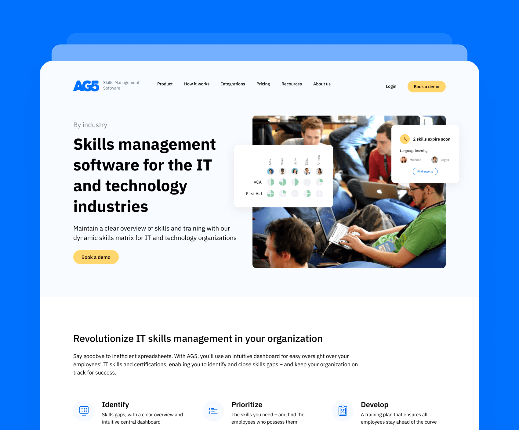
On the architecture side, I reorganized the site into distinct zones, overview, features, use cases, resources, so visitors always know where they are and what to do next. Each section flows logically, guiding users toward a demo or trial sign-up.

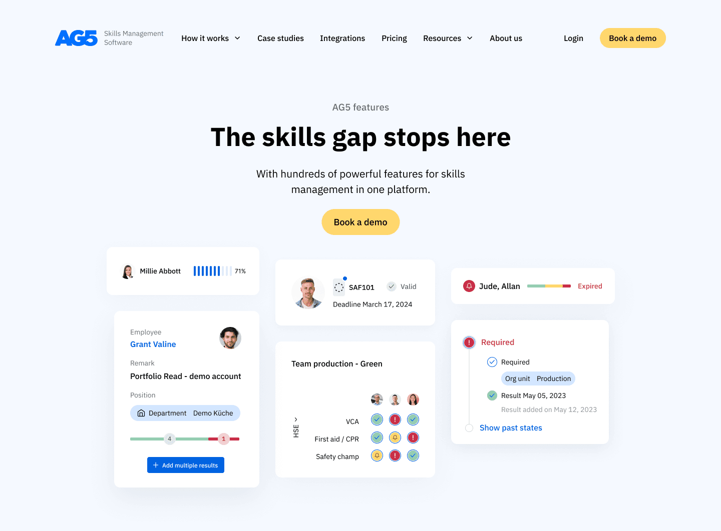
Visual Design & Live Product Animations
With the system in place, I replaced old illustrations with short looping clips of the AG5 dashboard in action. These animations live in the hero, feature call-outs, and case study previews, giving prospects an immediate feel for the interface and key workflows.
I paired these demos with a refined color palette that highlights calls to action without overwhelming the eye and chose a clean sans-serif font family for maximum readability. Micro interactions, like button hover transitions and animated chart reveals, add subtle delight and reinforce the sense that AG5 is both powerful and approachable.
Content Strategy & Copy Improvements
Clear messaging was just as important as visuals. Working alongside the copywriter, I:
Rewrote all headlines to focus on user benefits, not features
Created new pages for industry-specific use cases in education, manufacturing, and healthcare
Consolidated or removed low-value sections to streamline the journey
Added strong calls to action at the end of each section, tailored to the visitor’s stage in the buying cycle
This strategic cleanup made every page feel purposeful and directed users exactly where they needed to go.
Key Features & New Components
To enhance engagement and support ongoing marketing efforts, I designed:
A sticky support-chat widget that instantly connects prospects with AG5 experts
A flexible blog template with custom hero images and modular content blocks
An updated navigation bar that highlights demo and pricing pages prominently
Multiple new pages such as support, by roles, industries, product page and so on.
An expanded footer with clear links to legal, social, and resource hubs
Each new component drew on the design system, ensuring a seamless, branded experience.

Results & Impact
The redesign brought noticeable improvements to both user experience and internal satisfaction. By replacing outdated visuals with actual product animations and enhancing feature clarity through better UX, users were able to understand AG5’s offering more quickly and intuitively. This led to increased engagement across the site.
The team was genuinely pleased with the transformation. I consistently delivered ahead of schedule and received thoughtful appreciation from both the marketing lead and the CEO for my contributions and dedication. My close collaboration with both the marketing and product teams helped strengthen the brand’s digital presence and build more trust with visitors.
In the year following the redesign, AG5 experienced substantial growth and a significant increase in funding. While many elements contributed to this progress, the improved design played an important role in communicating the product’s value more clearly and professionally to both users and stakeholders.
Check the full website here
Next Steps & Lessons Learned
Working on AG5 was an enriching experience that challenged me to operate independently while staying deeply aligned with team goals. As the sole designer on the project, I learned how to prioritize efficiently, manage feedback loops remotely, and adapt quickly to shifting needs across both the marketing and product departments.
Collaborating with a distributed team taught me the importance of clear documentation, proactive communication, and building trust through consistency. This experience also strengthened my ability to translate complex product functionality into a clean and engaging visual language that supports both business and user goals.
Looking back, AG5 sharpened my ability to deliver high-impact design solutions in a fast-moving environment, while balancing creativity with clarity and strategy.