Project Overview
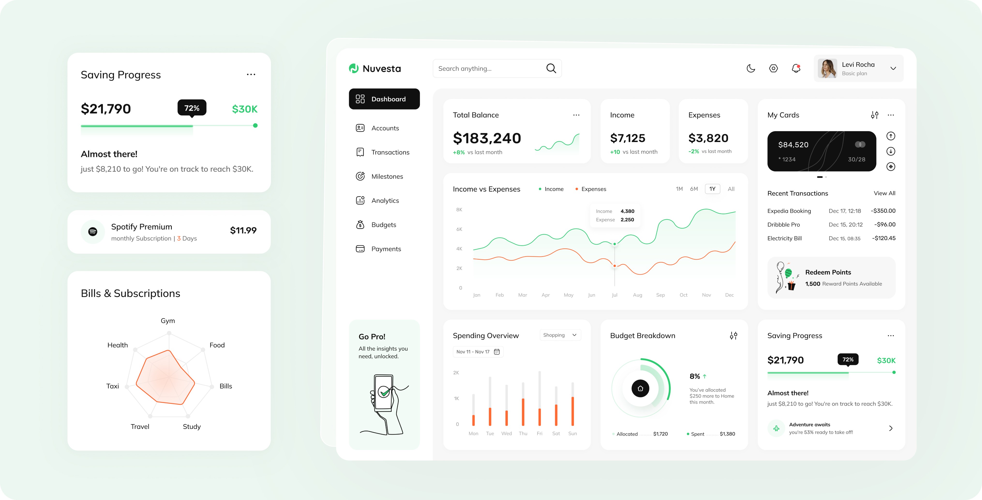
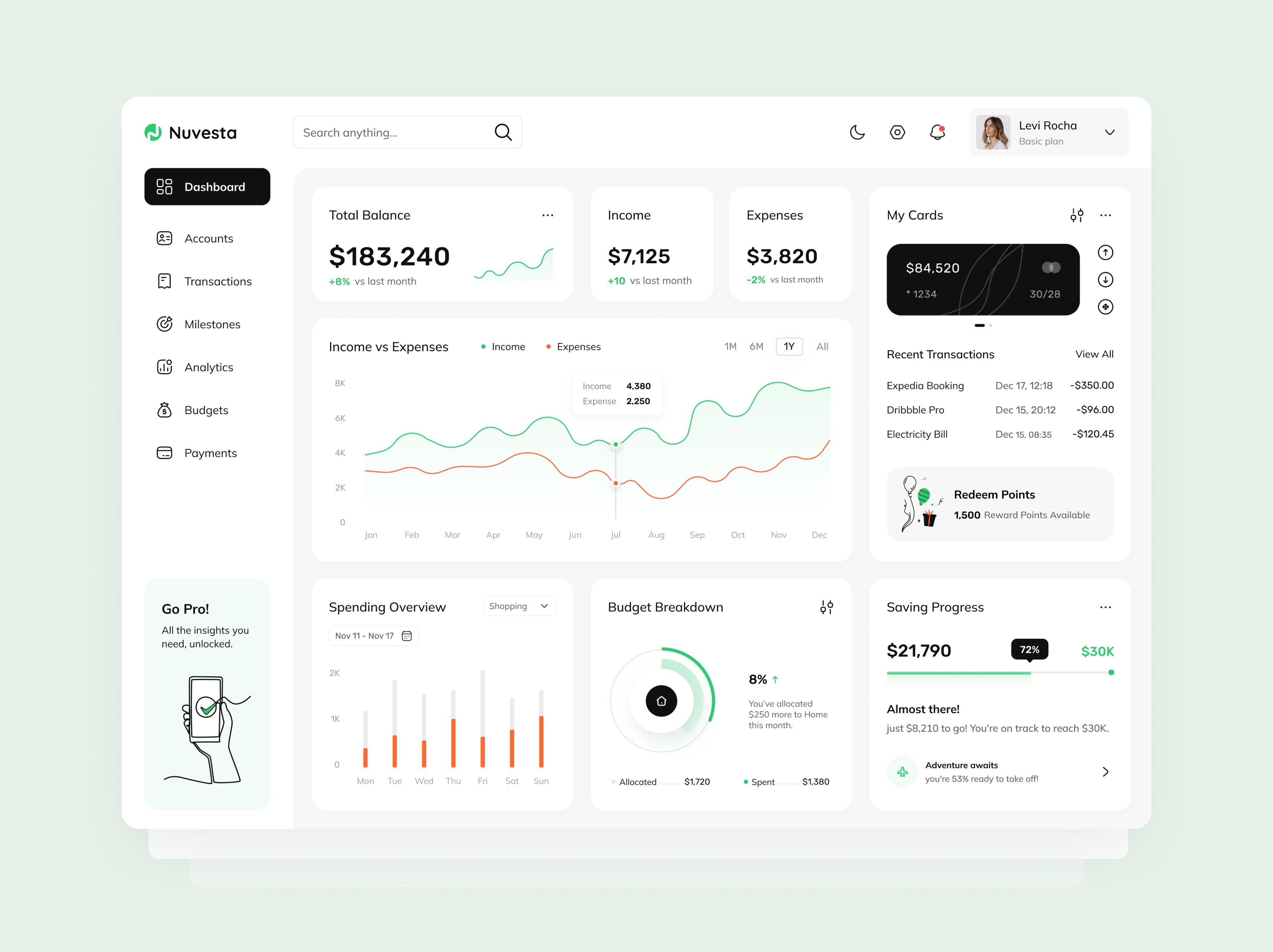
Nuvesta is a desktop‑first finance management dashboard that unifies total balance, income versus expenses, spending categories, budget breakdown and savings progress on a single, light‑themed screen. I led the end‑to‑end UX and UI process, from initial research through pixel‑perfect design and developer handoff.
My Role
As the sole designer on this project, I was responsible for driving the product experience from concept to delivery. I worked closely with stakeholders to understand financial workflows and user goals, translating them into a cohesive design system. My focus was not only on visual clarity but also on crafting intuitive, data-driven interactions that aligned with real-world finance behavior.
My contributions spanned the full product design process and included the following key responsibilities:
• UX and UI Designer
• User research, information architecture, user flows
• Wireframes, high‑fidelity visual design, interactive prototyping
• Collaboration with developers and stakeholders
Challenge & Objectives

It was important to display top‑level financial metrics clearly and make trends immediately understandable. Key objectives included:
• Presenting total balance, income and expenses in prominent cards
• Visualizing trends over time with an interactive chart
• Summarizing budget and savings goals in engaging visual elements
• Enabling quick access to transaction details without clutter
• Maintaining a clean, intuitive interface that feels fast and approachable
Research & Insights
To design a dashboard that truly meets user needs, I began by exploring how individuals interact with personal finance tools and what challenges they face in managing their income, expenses, and subscriptions. I conducted a mix of qualitative and quantitative research to ensure both behavioral patterns and user expectations were captured.
This research revealed the following key insights, which guided early design decisions:
1. Quantitative Survey
• Surveyed 50 existing finance‑app users to measure pain points
• 72% reported confusion when key metrics were buried in menus
• 65% wished for a single‑page overview
2. Usability Interviews
To better understand user behavior and frustrations with current personal finance tools, I conducted six remote moderated usability interviews with participants aged 25 to 50. Each participant was asked to complete key tasks using a basic prototype, including:
• Locating their current account balance
• Checking whether they were staying within budget
• Exploring their spending breakdown by category
Throughout the sessions, I tracked:
• Time-on-task to identify friction points
• Observed behaviors such as hesitation or confusion
• Verbal feedback to uncover unmet needs or unclear UI elements
Common themes that emerged included difficulty locating the budget summary, unclear visual hierarchy, and a preference for simple visual representations over complex tables. Participants consistently appreciated quick-glance insights and intuitive navigation.
3. Competitive Audit
To position Nuvesta effectively in the market, I audited five popular personal finance tools, including YNAB, Mint, PocketGuard, Emma, and Revolut. I evaluated each product based on visual hierarchy, ease of navigation, consistency in terminology, personalization options, and transparency of data categorization.
Key observations included:
• Overuse of dark UIs that felt heavy and cognitively demanding
• Crowded screens with too much information competing for attention
• Hidden filters or toggles that led to user confusion
• Terminology inconsistency (e.g., “subscriptions” vs. “recurring payments”)
These insights helped shape Nuvesta’s design principles: clean, distraction-free layouts, consistent and user-friendly language, and quick access to critical financial data.
Key Findings
• Users want fast, clear access to high-level financial health
• Confusion arises from unclear category names and complex layouts
• Subscriptions and recurring charges are often overlooked
• Saving goals lack visibility and actionable feedback
These findings informed the design strategy to emphasize clarity, transparency, and user empowerment through visually digestible insights.
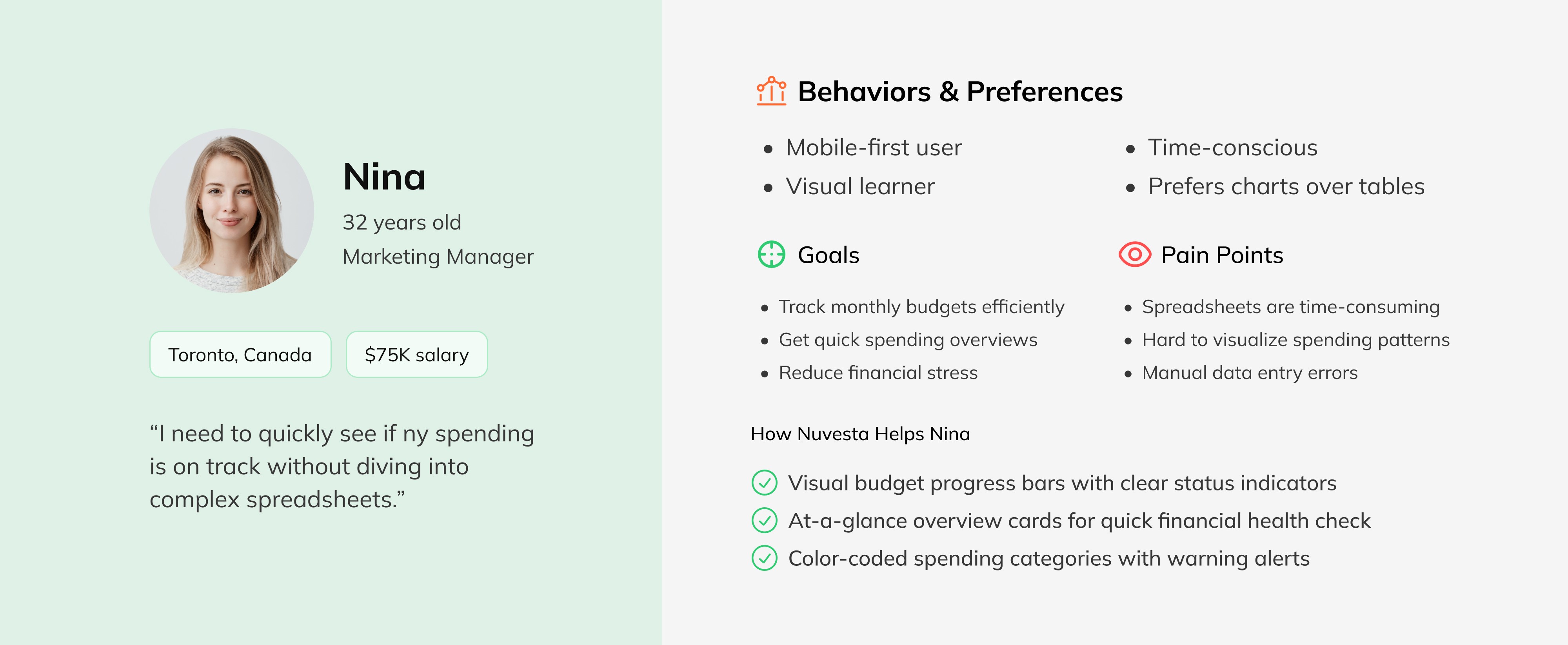
Personas
To guide design decisions, I created two user personas based on interviews and behavioral insights:
Nina, 32, marketing manager,
• Tracks monthly budgets in spreadsheets
• Needs a quick way to see if spending is on track
• Values clear visual cues over dense tables
Omid, 45, freelance consultant
• Juggles multiple income sources
• Looks for trends to inform quarterly planning
• Prefers light themes and minimal interface noise
These personas helped me prioritize dashboard layout, terminology, and interaction patterns, keeping usability tailored and intentional.
Information Architecture & User Flows
To create a smooth and intuitive experience, I mapped out the core structure of the app early on. This involved identifying the most important user goals and arranging content in a way that feels natural and efficient. Clear navigation, logical grouping of features, and a minimal learning curve were all top priorities.
These flows and structures ensured the following design priorities:
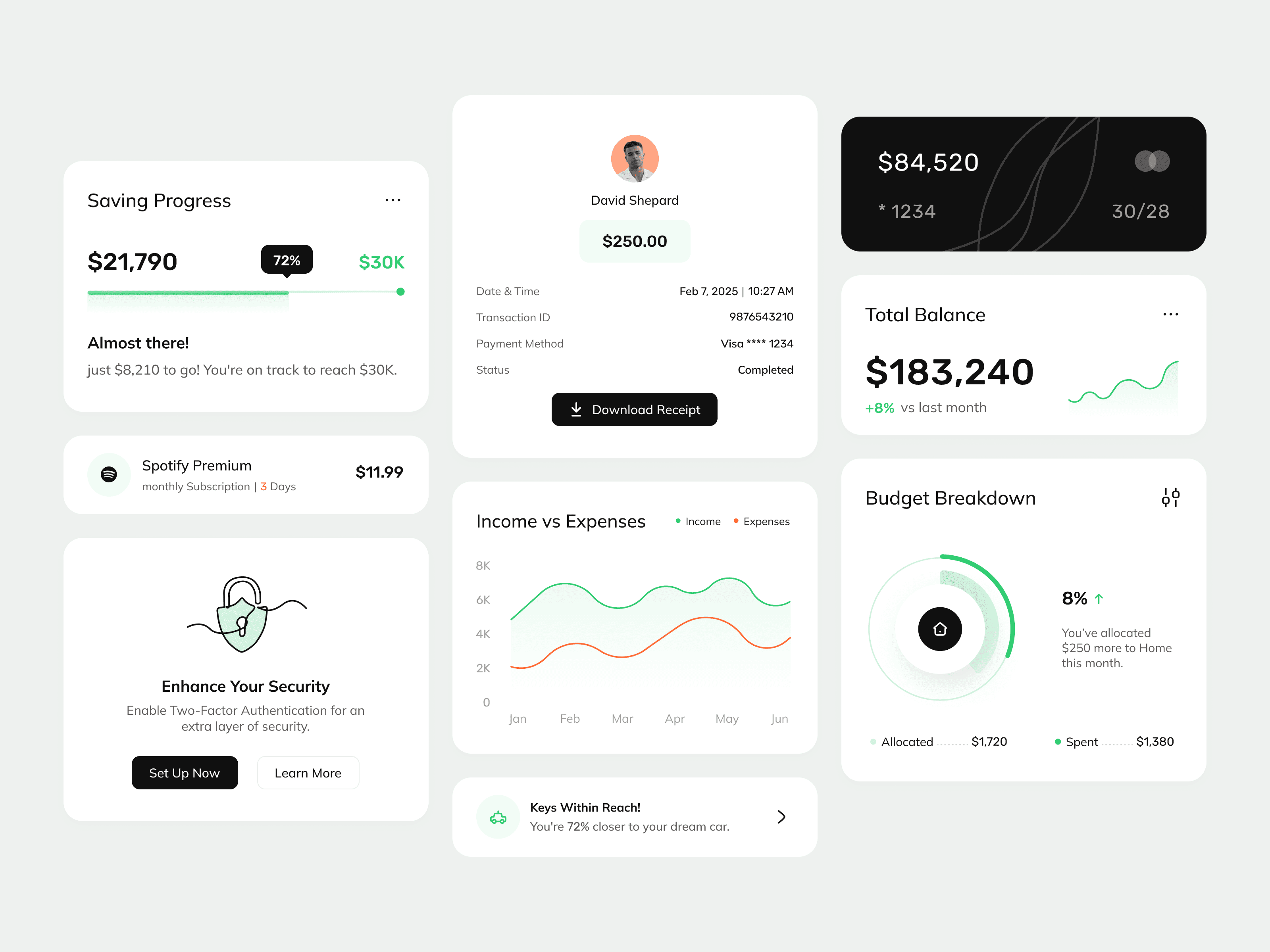
1. Summary Cards (balance, income, expenses)
2. Income vs Expenses Chart with time‑range filters (1 month, 6 months, 1 year, all)
3. Spending Overview by category with drill‑in capability
4. Budget Breakdown as a circular progress indicator
5. Savings Progress bar comparing current and target amounts
6. Side Panel for card management, recent transactions and rewards
Mapped user flows for:
• Locating summary metrics in under five seconds
• Switching chart time‑range and interpreting hover tooltips
• Drilling from a spending bar to a detailed transaction list
Wireframes & Prototyping
I began with low-fidelity wireframes to explore layout ideas and test structural clarity early on. This step helped define content priorities, user pathways, and component hierarchy without the distraction of visuals. As the design matured, I created high-fidelity wireframes and interactive prototypes to simulate key user flows. Considering interactions from the start was essential to ensure a smooth and intuitive user experience.
This phase laid the groundwork for a polished visual system and smooth collaboration with developers.
• Sketched low‑fidelity wireframes in Figma to validate layout and information hierarchy
• Built a mid‑fidelity clickable prototype covering desktop breakpoints
• Ran two rounds of prototype testing with four users to refine tooltip placement, filter labels and hover states
Visual Design
• White background with soft shadows to separate cards and panels
• Single sans‑serif typeface in three weights for clear hierarchy
• Green color for positive trends and progress
• Red only when budgets are exceeded
• Neutral gray for baseline elements
• Hover on summary cards reveals quick‑action icons
• Focus on chart points displays exact values in tooltips
• Smooth transitions when changing time‑range
Developer Handoff
• Organized Figma file with clear naming conventions, auto‑layout and design tokens
• Documented colors, typography and spacing in a style guide
• Exported assets and provided interaction specs using Figma comments and redlines
• Hosted a walkthrough session to explain animations and responsive behaviors
Validation & Outcomes
• Time to locate total balance dropped from 12 seconds (competitor average) to 4 seconds in user tests
• 92% of participants rated the dashboard “very clear” on a five‑point scale
• Positive feedback on the savings progress bar as a motivational element
• Development handoff completed two days ahead of schedule
Next Steps & Lessons Learned
With the dashboard and dark mode already designed and developer-ready, the focus now shifts to future iterations and strategic enhancements.
Next Steps
• Expand the Dashboard Capabilities: Introduce features like budgeting suggestions, savings goal notifications, and customizable widgets for different user needs.
• User Testing & Feedback Loops: Conduct usability tests post-implementation to validate assumptions, track behavior, and uncover unexpected pain points.
• Advanced Financial Insights: Explore adding predictive analytics and spending forecasts to make the tool not just informative, but truly proactive.
• Cross-Platform Optimization: Adapt the experience for mobile and tablet use, ensuring consistency and usability across all screen sizes.
Lessons Learned
• Designing for data-heavy products requires a deep understanding of hierarchy, scannability, and cognitive load.
• Creating both light and dark modes early in the process resulted in more flexible design decisions and fewer visual inconsistencies.
• Stakeholder feedback is most effective when framed within clear UX goals, helping keep discussions focused on users, not opinions.
• Motion design and micro-interactions added not only visual delight but also functional clarity to user flows.
• User empathy is critical, especially in financial tools. people need control, clarity, and emotional trust when dealing with money.
Designing Nuvesta reinforced how clarity and consistency drive user confidence. By structuring information into digestible cards, using consistent color cues and validating every interaction, I delivered a dashboard that feels both powerful and approachable.