Project Overview
Fluent is a mobile-first language learning app designed to help users improve their real-world speaking skills through interactive feedback, smart practice sessions, and personalized learning paths. The product’s core value lies in reducing anxiety around language learning by making pronunciation feedback actionable and encouraging.
The primary goal of the project was to create an intuitive user experience that motivates learners to practice daily, build speaking confidence, and track their growth through engaging visuals and feedback loops.
My Role
As the sole product designer on this project, I was responsible for shaping the entire experience from initial research through to interactive prototyping. Working closely with the product strategist and developers, I translated real user needs into elegant design solutions that kept usability at the center.
• UX and UI Designer
• User research, user flows, information architecture
• Wireframes, visual design, prototyping, microinteraction planning
• Collaboration with stakeholders and development handoff
I approached the challenge by focusing on the emotional experience of language learning, balancing clarity, warmth, and motivation across every screen.
Research & Insights
To better understand the emotional and functional needs of language learners, I reviewed interviews, online learning forums, app reviews, and user behavior patterns in existing products. The research uncovered key frustrations users typically face when learning to speak a new language, especially around pronunciation and confidence.
These findings helped shape the early direction of the product:
• Learners often feel self-conscious about their accent and progress
• Many apps fail to give meaningful feedback on pronunciation
• Users want fast, actionable tips without overwhelming detail
• Motivation and encouragement play a huge role in consistent learning
User Personas
I created two core personas to guide the product direction and prioritize key tasks and emotional drivers:
Fatima, 38, Busy Multilingual Mom
A working parent learning English to support her family’s transition abroad. Needs bite-sized lessons and clear pronunciation help without academic jargon.
Julien, Motivated Job Seeker
Learning German to improve his job opportunities. Values detailed feedback, smart tracking, and real-world conversation practice.
These personas helped me shape the voice of the app, refine the navigation structure, and build features that deliver emotional support while encouraging momentum.
Information Architecture & User Flows
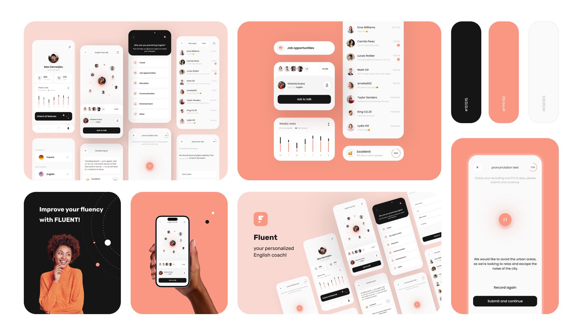
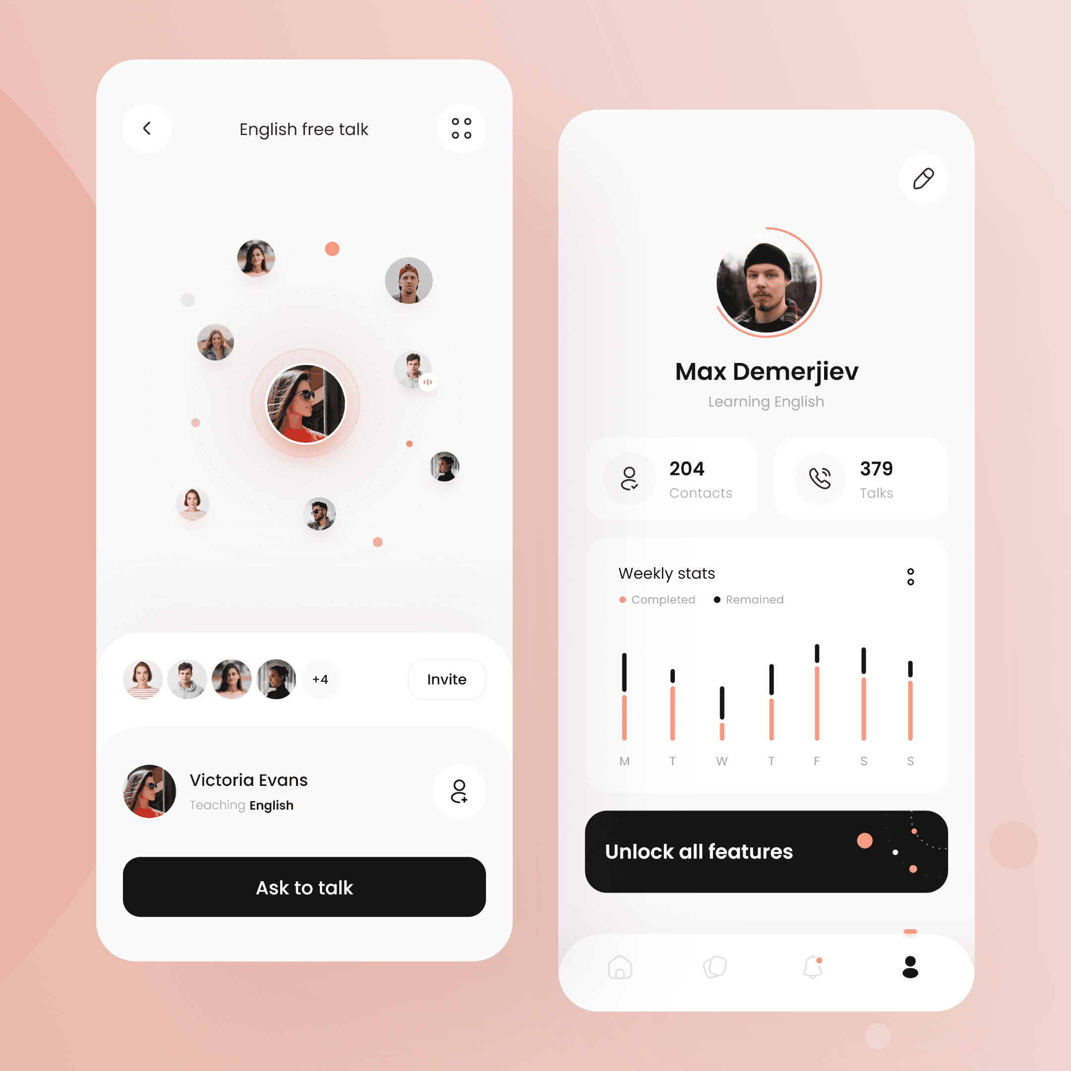
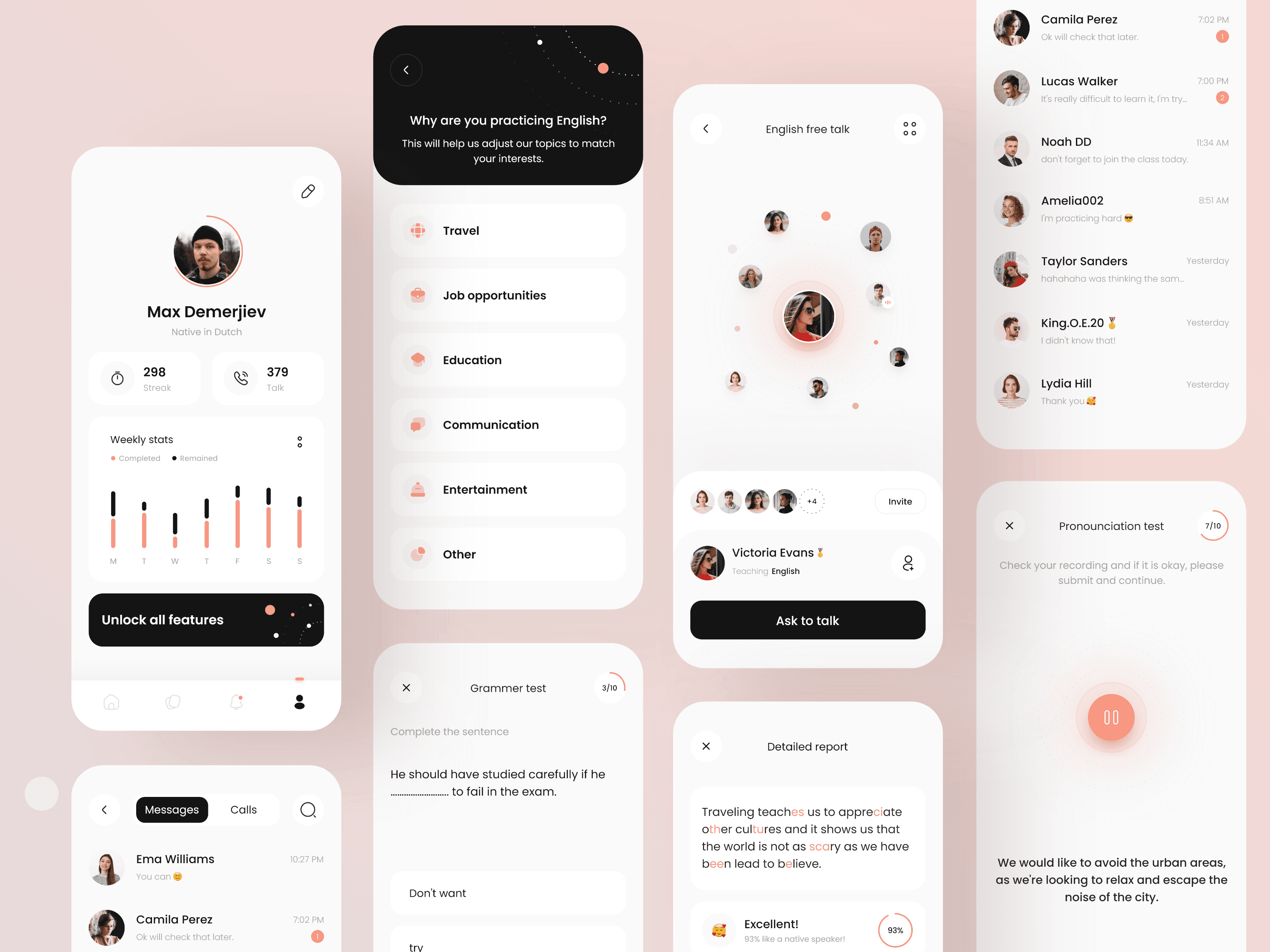
At this stage, I mapped out the core user journeys, starting from onboarding to guided practice and feedback review. To ensure learners could easily navigate between conversations, corrections, and reports, I created a simple, modular structure.
• Dashboard with learning streak and next practice
• Speaking session with immediate feedback
• Visual reports on fluency and pronunciation
• Peer interaction (chat/calls) to build confidence
Special attention was paid to minimizing cognitive load while still making learners feel in control of their progress.
Wireframes & Prototyping
Low-fidelity wireframes allowed quick iteration on key interactions and flows, from lesson navigation to detailed feedback screens. I tested wireframes with real users to validate usability before moving to visual design.
When moving into high-fidelity, I focused on clear hierarchy, soft contrast, and emotionally positive visuals. Interactions like feedback scoring and peer chats were designed to feel rewarding rather than evaluative.
Interactive prototypes were used to test task flows such as reviewing a pronunciation score or messaging a language partner. Since the experience heavily relies on user motivation, microinteractions were carefully planned to ensure feedback moments felt supportive, not robotic.
Visual Language & UI Design
The UI system was built to be soft and modern, with rounded cards, pastel feedback highlights, and friendly icons. Typography emphasizes readability while maintaining warmth. Buttons and feedback states guide users gently through their tasks.
Color also plays a big role in supporting emotional feedback. subtle reds for pronunciation flags, oranges for highlights, and affirming icons for positive reinforcement. Empty states and progress visuals use human-friendly tone and expressive emoji where appropriate.
I designed for both light and dark mode to allow comfortable use during different times of day, ensuring consistent hierarchy and legibility across both themes.
Designing for Motivation
Motivation isn’t just about gamification. I focused on building a sense of growth and belonging into the interface itself, small affirmations after each session, quick tips that feel personal, and a community feature that lets learners message or call their peers for support.
This wasn’t about “levels,” but about letting users feel their effort pay off.
Developer Handoff
Design files were prepared in a structured component system to speed up development. I ensured the interactive prototype clearly demonstrated transitions, tap areas, and behaviors. A full UI kit and motion references were provided, along with documentation for logic in feedback scoring and visual rules for highlight color coding.
Collaborating with developers during handoff ensured implementation matched the emotional tone we’d crafted in the designs.
Next Steps & Lessons Learned
• Plan for in-app assessments to adjust content based on speaking pace
• Expand personalization features based on learning history
• Introduce gentle reminders and streak-saving features in future versions
• Consider accessibility improvements for voice-based instructions
• Include smart summaries after a week of learning to show growth
Working on Fluent reminded me how much design impacts confidence. Every small decision, from a button label to the way feedback is framed, affects how learners feel about their ability to grow. That’s the kind of design I want to keep doing.